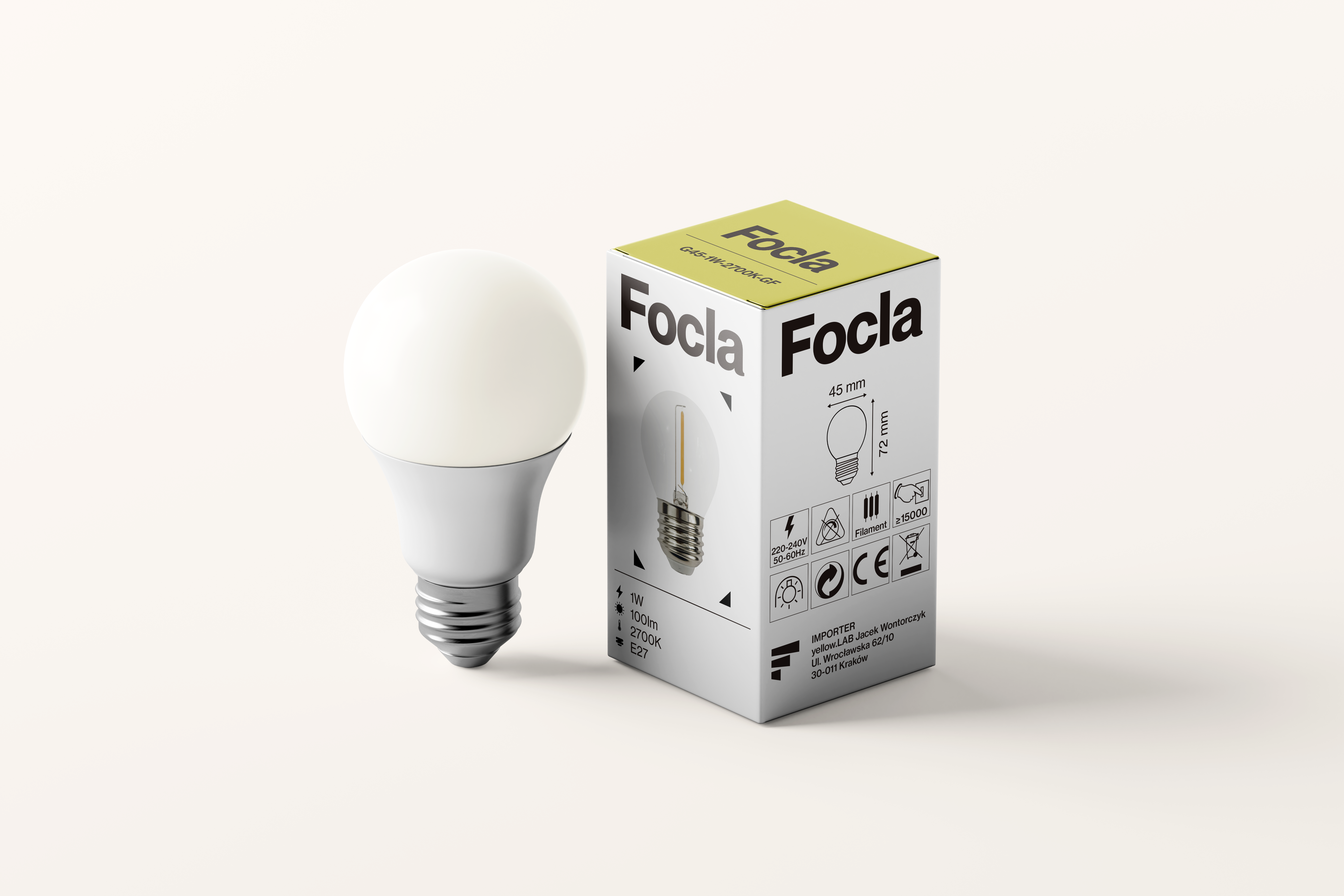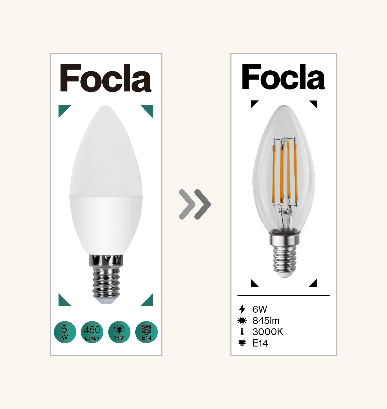

In order not to significantly change the character of the packaging (to make the brand recognizable on the market), in accordance with the client's request, I used existing elements to create a new, modern and minimalist design. My goal was also to maximize the readability of icons and data. The new icons are clearly visible and match the design. I also made the font consistent so that there were no several font families in one project. The most interesting colors from the previous packaging were retained in accordance with the client's request so that the new style did not differ significantly from the previous design.