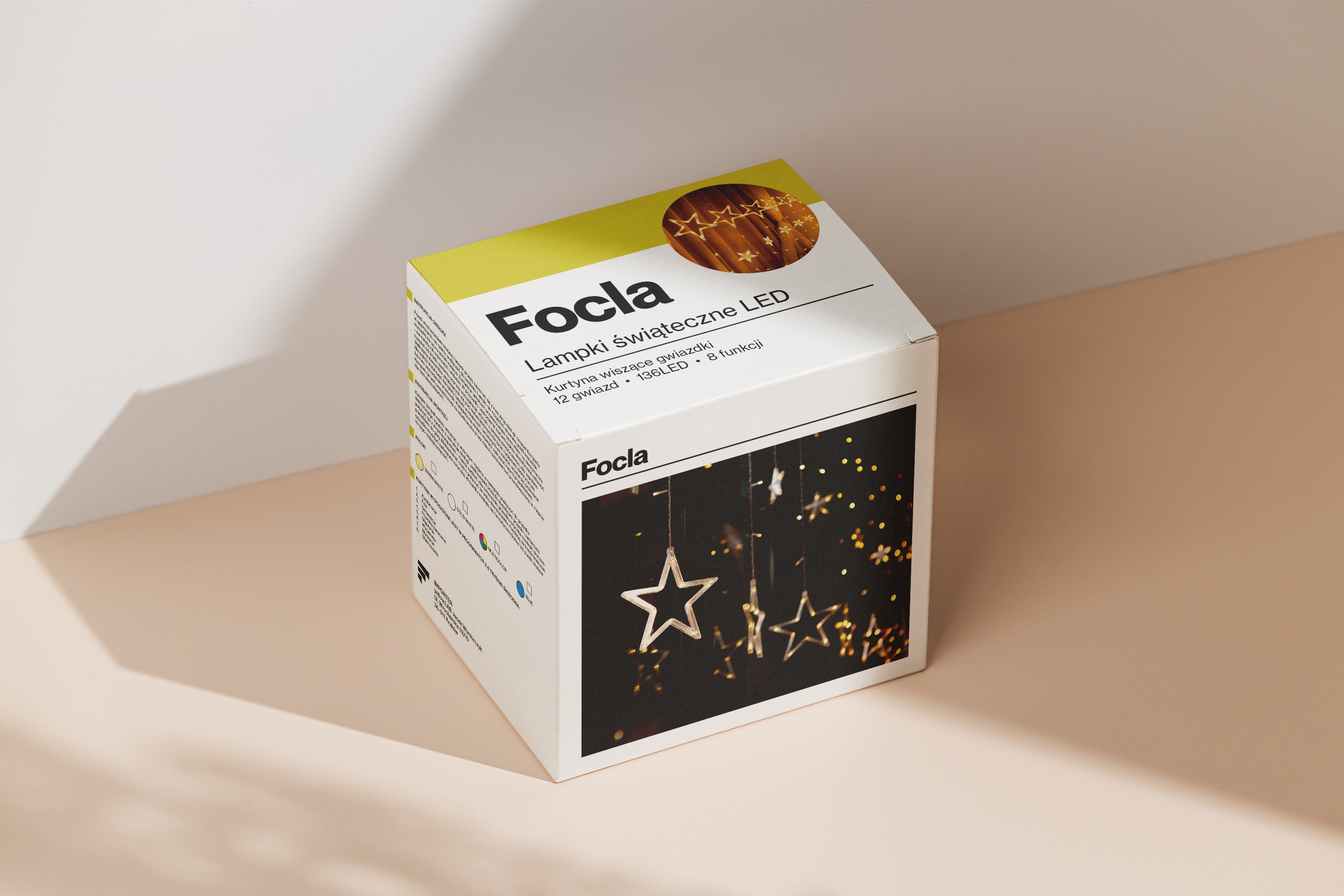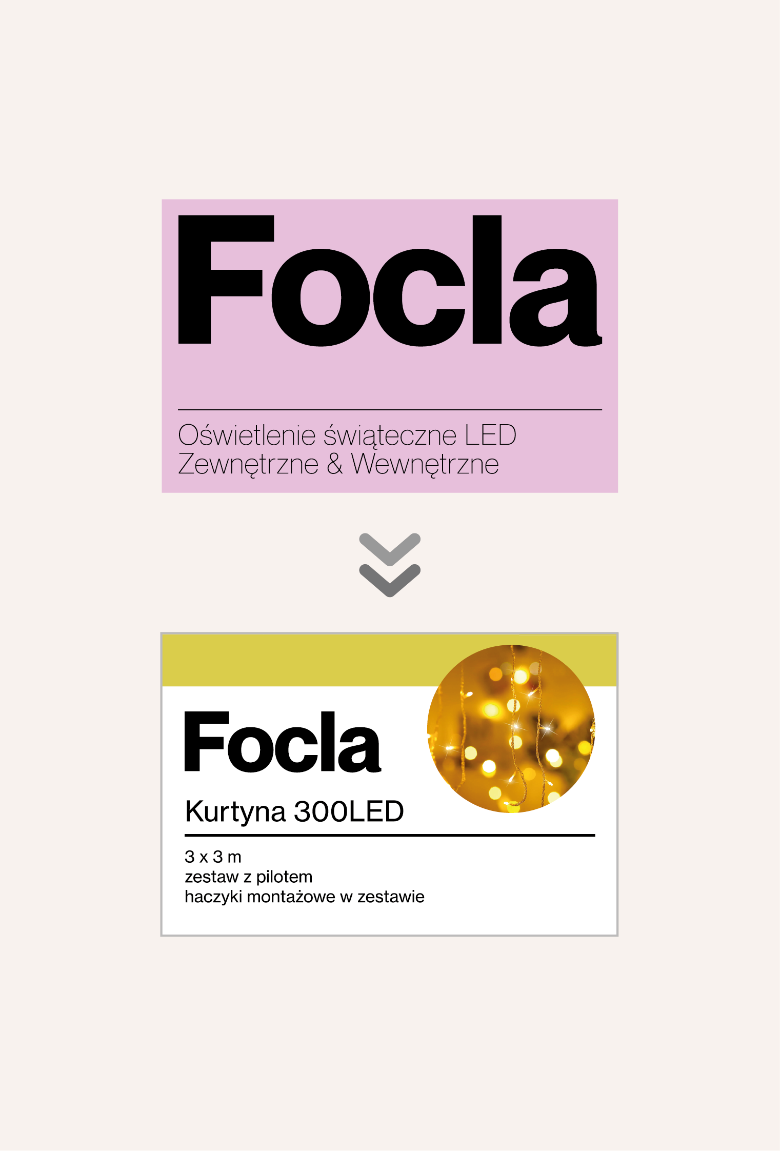

In order not to differ significantly from the character of the original design, in accordance with the client's request, I referred to elements from the previous project in my design. I used the line under the logo, but I gave it a different, more decisive character that matches the typeface of the logo. I also increased the readability of names and other content to ensure that the packaging was also functional and the information about the product is clear. My task was also to include product photos into the graphics. I proposed a new layout with a circle on the front flap next to the logo with enlarged photo of the product. Furthermore, I suggested placing a second, larger photo of the product on the front of the box. I also maintained graphic consistency with the bulb packaging, which contains slightly different elements and content. The best colors from previous projects (in accordance with the customer's request) have been preserved in the new packaging.